It’s a little bit funny but I already have some tech debt on my new Timechief project.
I started a development iteration on the weekend and decided to begin by fixing some of this crud. The most interesting thing I’ve fixed up is probably the handling of weather conditions.
Previously I took the weather condition pretty much as given from the OpenWeatherMap API.
There are some problems with this:
- My user interface is only going to support one icon per time slot, that is, one icon for the current time, or per daily forecast
- Open weather map returns more than one weather conditions, so I had picked the first one and ignored the rest
- Not all possible weather states seem to be represented by conditions returned by OWM
- After using my clock for a month, I realised that the conditions were sometimes not accurate to my lived experience
Number 4 is interesting. I have total faith that OpenWeatherMap are providing a scientifically accurate forecast. They return codes for things like “scattered clouds” or “broken clouds”.
If you’re a weather nerd, you’ll know that cloud coverage is defined in terms of Oktas. It seems like the open weather map API is based on this. Being in a different Okta is the difference between few, broken, scattered clouds.
While strictly accurate, this level of info is not correct for a casual user. I only want to look at my clock and know what clothes to wear when I go out. See below for redundancy: what is light rain?
On number 3, the OpenWeatherMap weather conditions list does not include conditions for concepts like “it’s windy!” The wind speed is returned by the API, but it doesn’t seem to be returned as a condition.
How did I make it better on my clock?
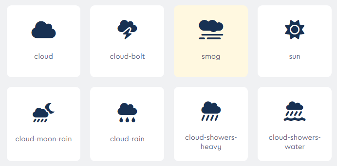
For weather icons I am using font-awesome. It only has so many that I want to put on the clock.
That makes the job a lot easier. We have so much scientific input data, but only a limited choice of output. It’s about squeezing it down and choosing something sensible to display.
I solved by creating a boolean scoring system that relates to each icon I can display. For example, if the precipitation is high, I score rain. If a OWM weather condition says “lightning”, I score lightning. I look at both raw weather data like wind speed, and also at the list of conditions.
After scoring I do a priority based pass. For example, if we have scored both “rain” and “lightning” then we return “lightning” because that’s probably going to impart most information to our users. I think a casual user could look at a lightning bolt on a cloud and think “that’s nasty weather”.
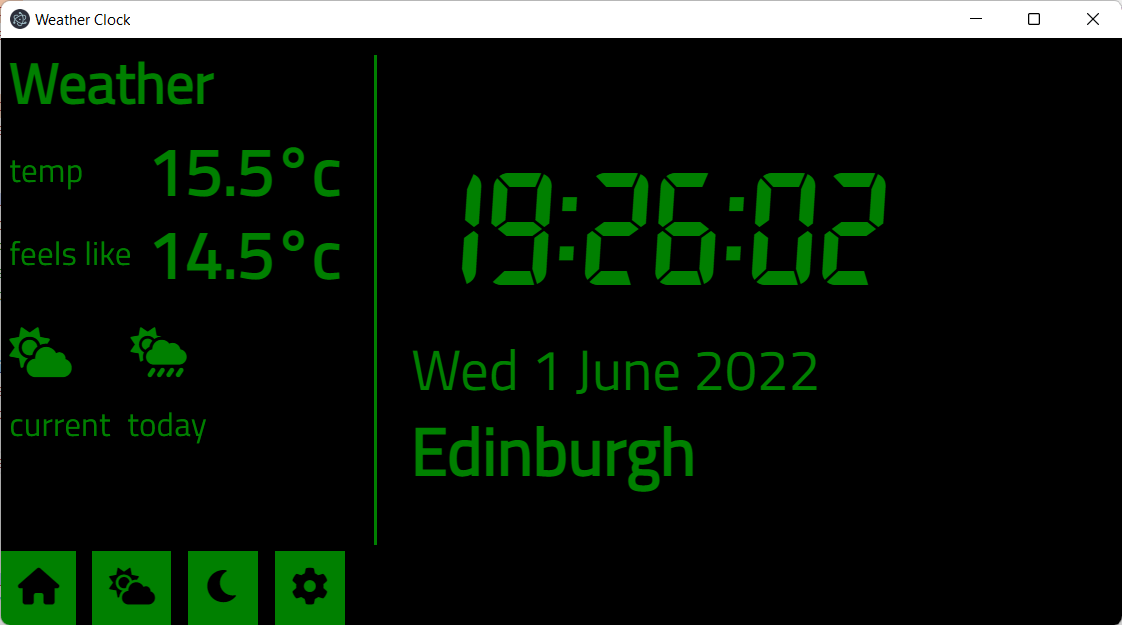
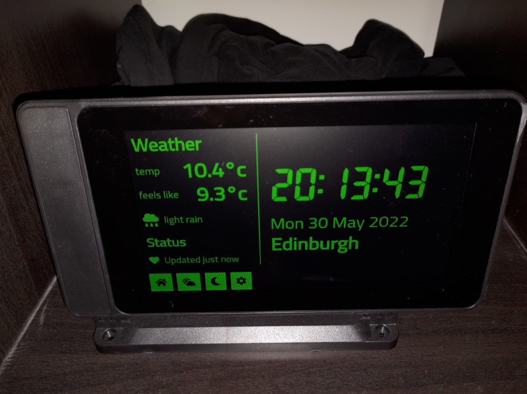
I also gave the clock UI a tweak so the home page displays the current weather as well as today’s summary.
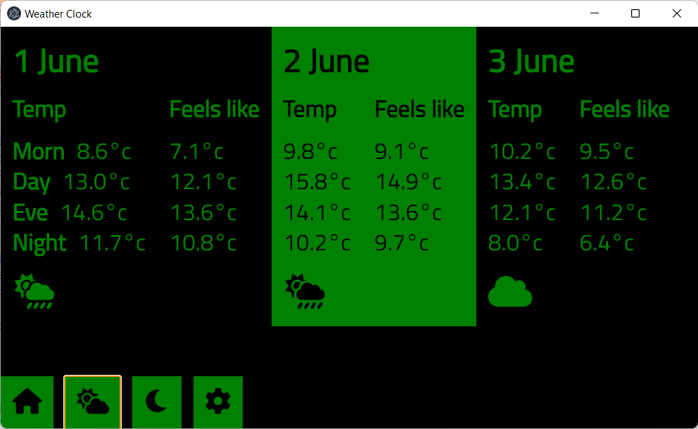
The forecast page remains as-is but shows the new icon set.
By the way, I have not considered the extreme weather use-case.
For obvious reasons, I don’t want to be the one responsible for processing weather data into weather warnings, so instead of deciding whether or not I should show an alert, I need to trust the experts, and go with what their API gives me.
OpenWeatherMap does return alert data, but I haven’t looked into how well that syncs up to “official” weather alerts, such as Met Office weather warnings in the UK. This use-case will be shunted off for a future iteration though. There is much work ahead of me.